Pepsi
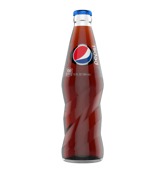
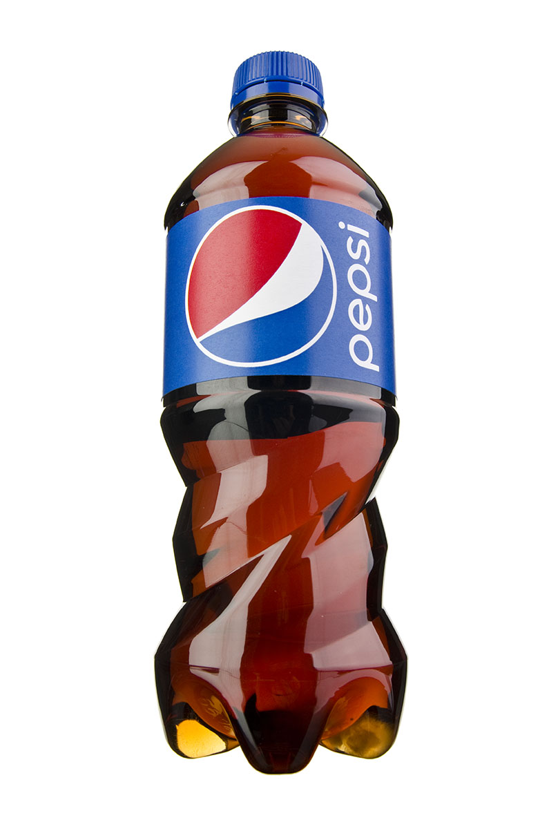
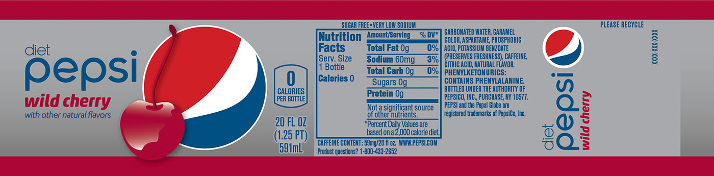
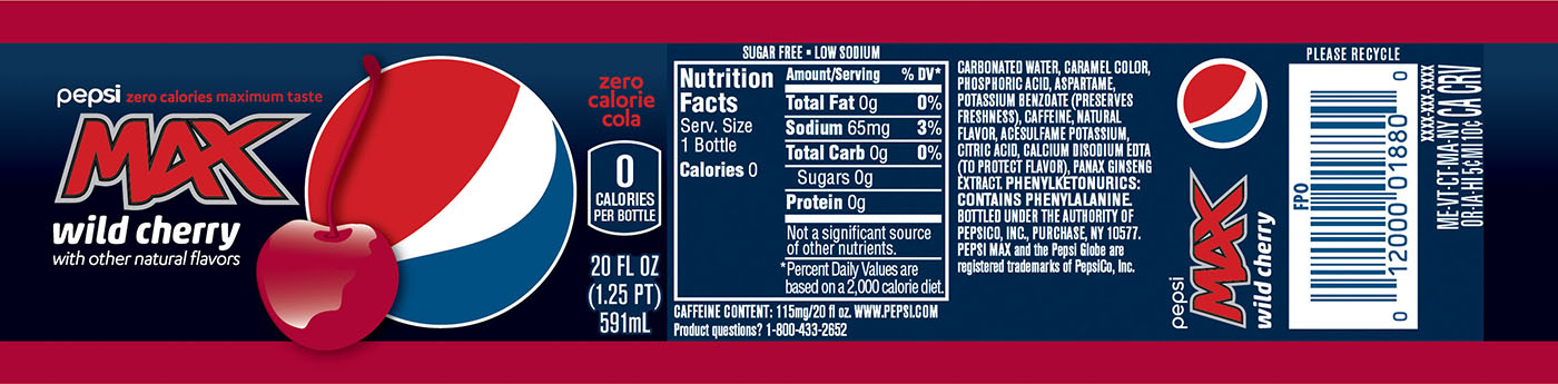
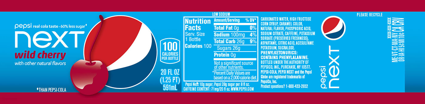
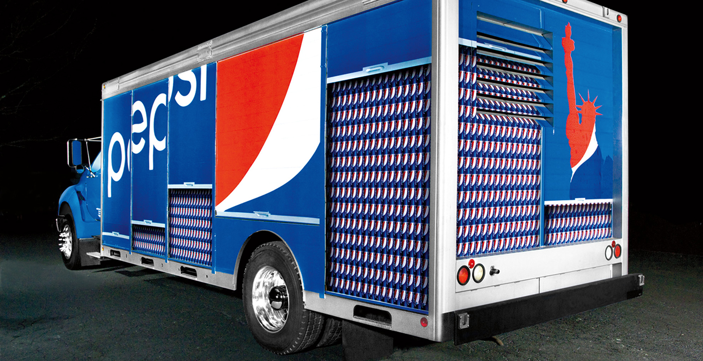
Pepsi had developed a new brand promise “Capture the excitement of NOW” and a relatively new logo, but the truth was there was no story behind the identity. They also had an immediate need to provide global markets graphic flexibility vs being locked in a rigid, corporate identity system. At Tether, we reexamined every aspect of the brand from the ground up. To kick-off the project, I visited not just Pepsi HQ in New York, but midwest bottling plants to explore every innovation in production and printing possible with our industrial designers. While simultaneously working on strategy and brand voice, we explored an army of new 3D bottle shapes and created a new graphic language for Pepsi.
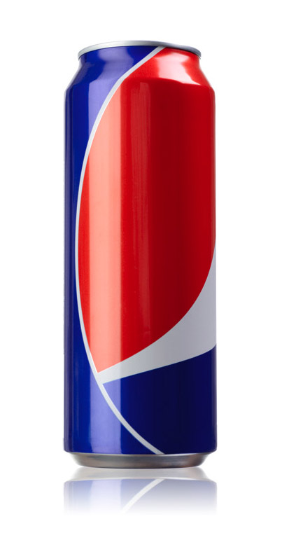
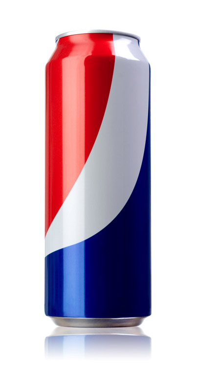
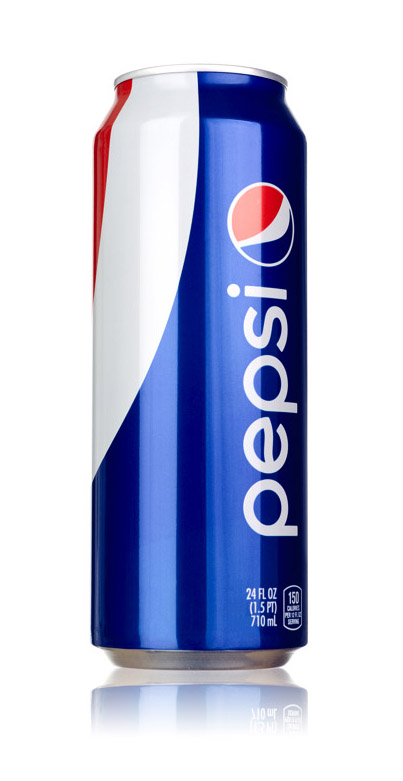
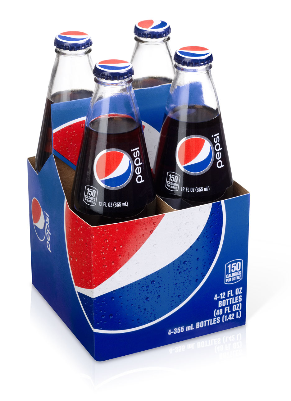
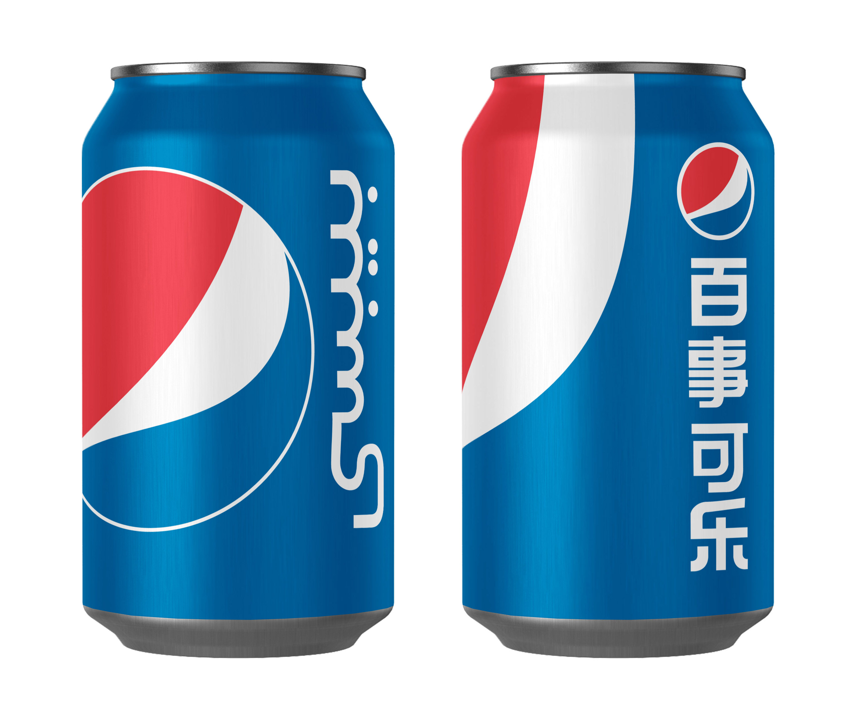
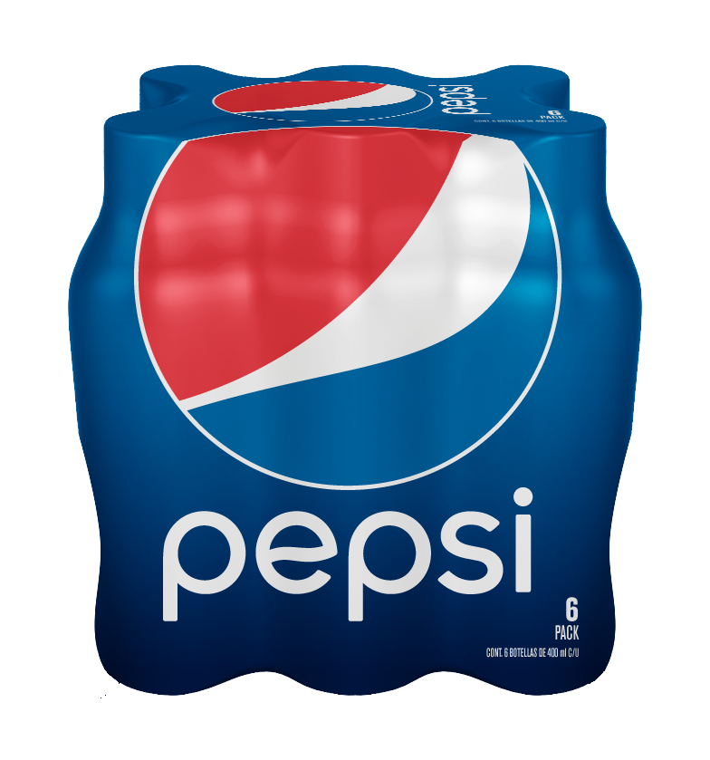
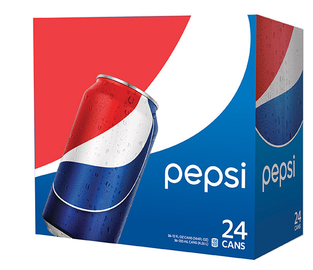
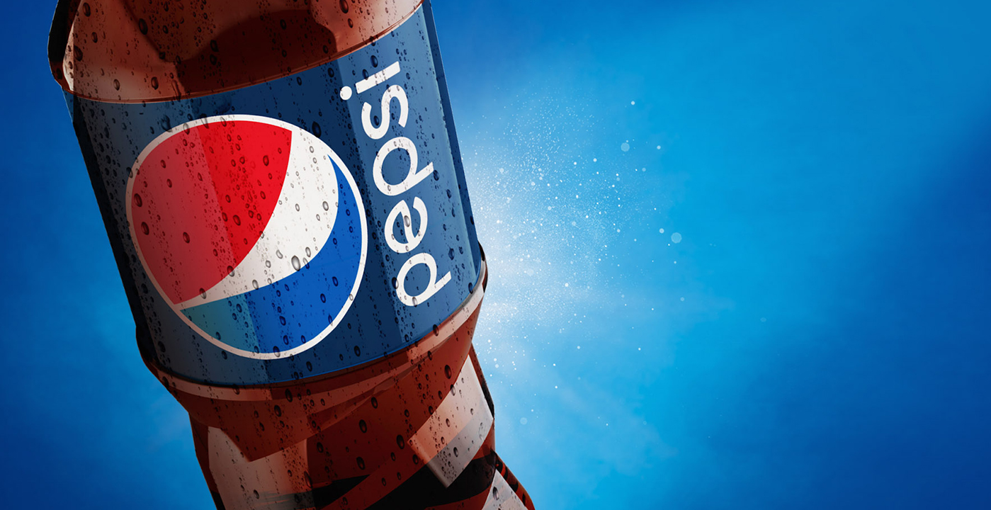
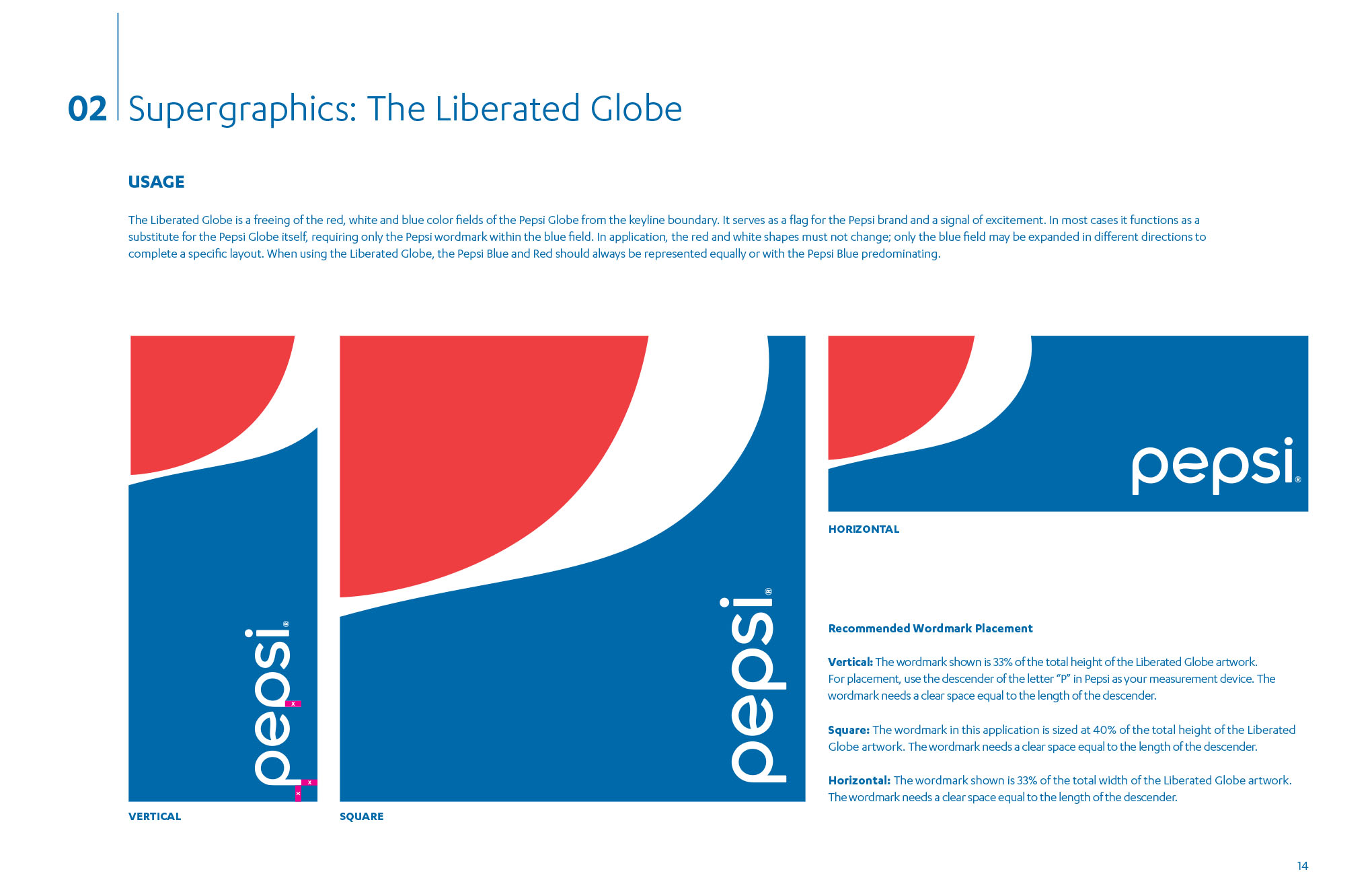
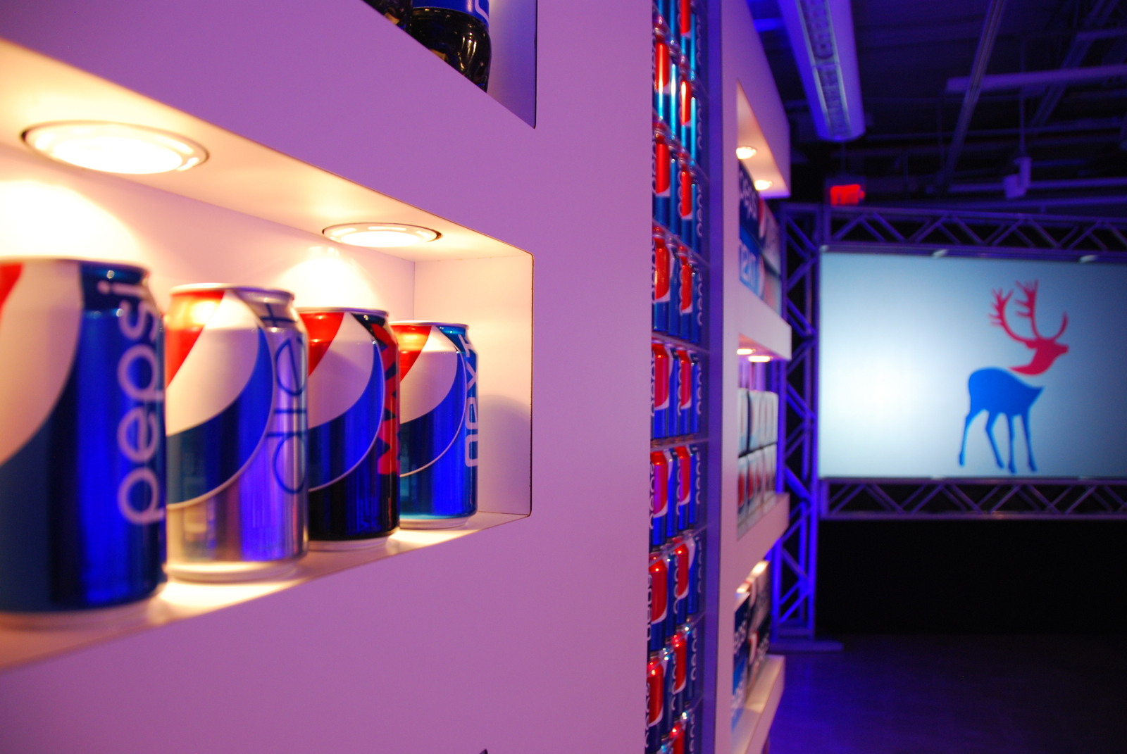
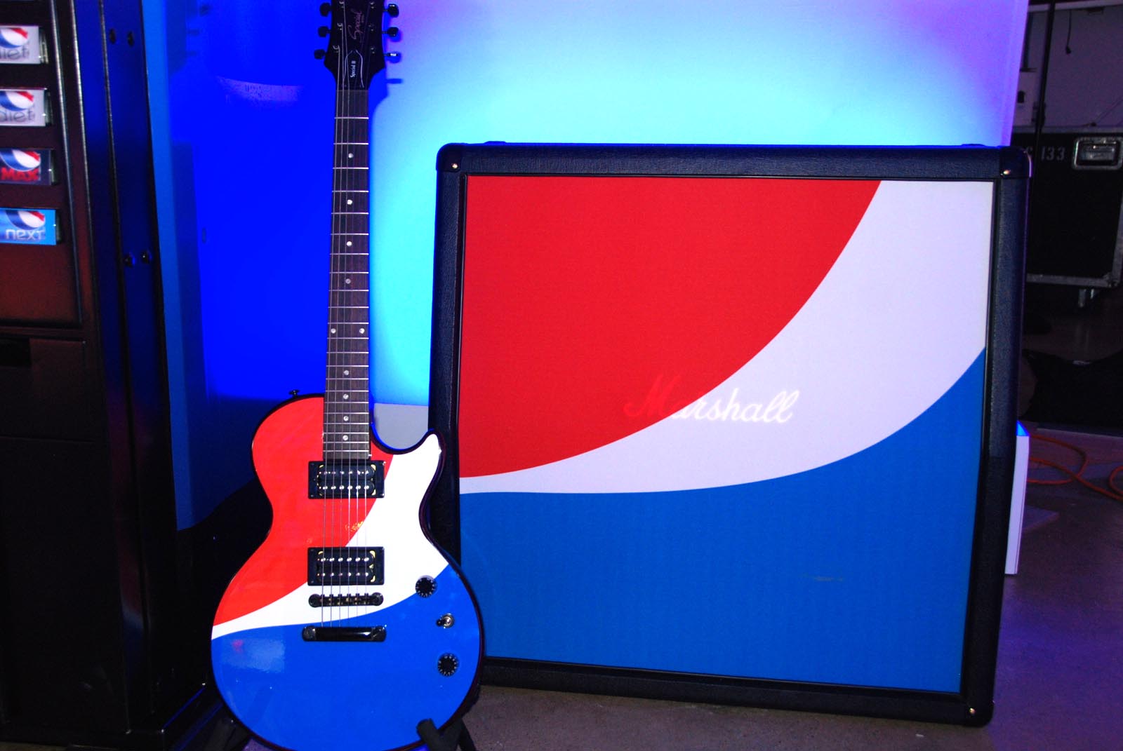
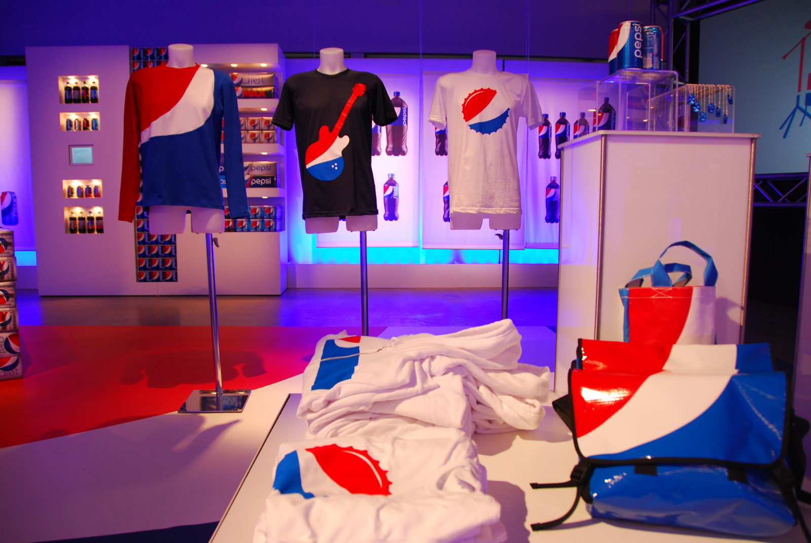
The lack of meaning behind the Pepsi globe was a prime concern for me and, in considering its form, I began to wonder what the red, white and blue looked like before being “trapped” by a circle. This line of thinking led to the idea of “liberating the globe,” or owning the color sequence red/white/blue regardless of the shape containing it. The result was a new, flexible visual language which inspired super-graphic logo applications at the top level, and varied, regionally-inspired icons for local markets. Pepsi’s new ability to speak directly to different audiences was a huge win and Mexico was an early market adopter of our designs.
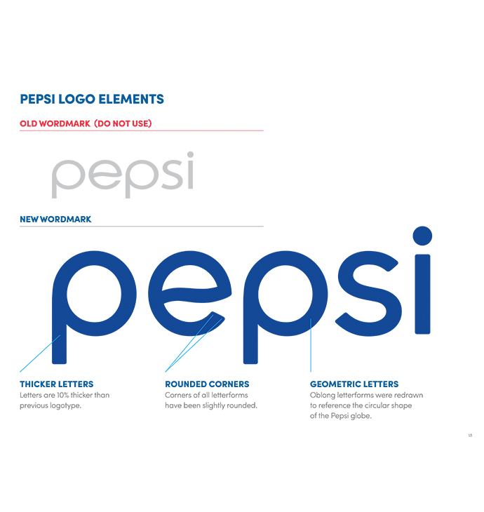
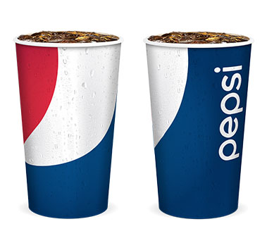
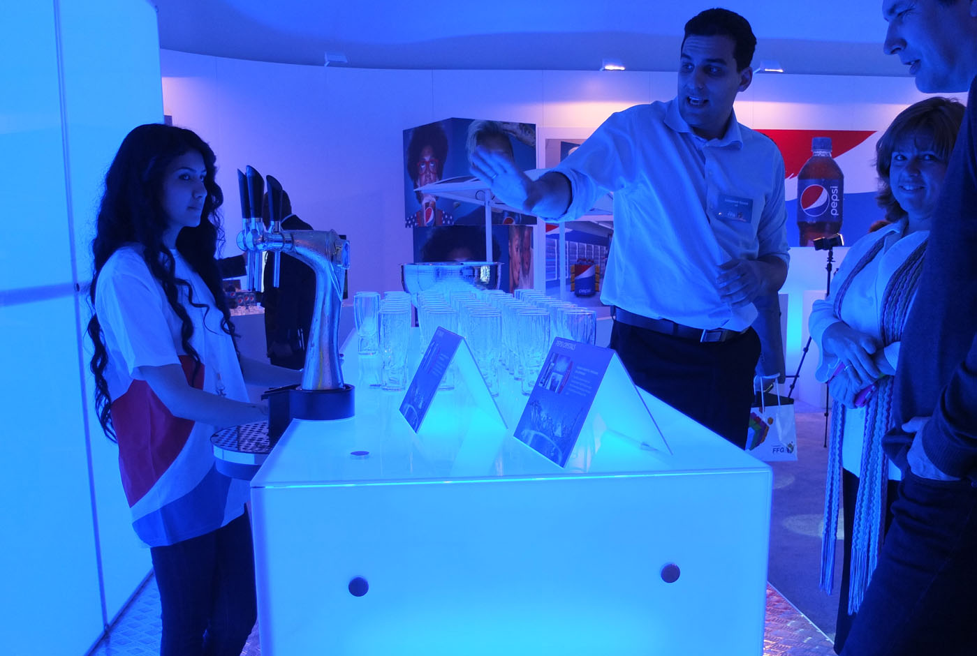
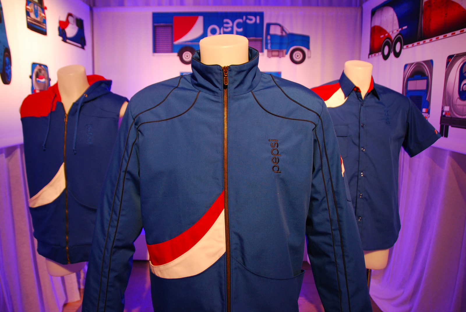
For more than two years, I art directed and managed scores of designers to develop hundreds of deliverables, including a revised Pepsi logo, consumer packaging, video, audio, swag, driver uniforms, truck graphics, fountain cups, and more. I designed and installed multiple 3D exhibitions to share our designs in progress with marketing teams and bottlers, from Mexico City to Dubai. Truly a project with global impact, one that earned us a Red Dot Award for excellence in packaging.
CCO—Stanley Hainsworth, ExecCD—Steve Barrett, CD—Daniel R. Smith, Writer—Neil Webster, Primary Graphic Designer—Nate Manny, plus numerous industrial + graphic designers
Tether case study